I Gave 6 AI Design Tools the Same Brief and Brand Kit. 5 Went Off-Brand.
Claude Design, ChatGPT, Canva, Gamma, Google Pomelli and AdCreative, each tested live on one campaign brief, recorded side by side and scored on a 15-point rubric. Only one of them kept the brand intact.

Key Takeaways
- In June 2026 I tested six AI design tools on one campaign brief, each recorded live next to Sketch Studio with no retries or edits.
- Five of the six went off-brand even with the brand kit or website to work from. Expect invented logos, stock robots and colours your brand has never used.
- Claude Design came closest, at 99/130 (76%). It got the colours, fonts and logo right, but generated no imagery and was the slowest tool tested.
- Most tools now write decent copy and size assets correctly. Where they differ is variety, the range of channels they can produce, and whether the brand survives.
- Check a tool's format list before anything else. Several can't make a landing page or a display banner at all.
Every AI design tool now has a brand kit feature. You upload your logo, enter your hex codes and name your fonts, and the tool promises on-brand output. I wanted to see how much of that promise survives a real brief.
So in June 2026 I ran six of the best-known tools on the same campaign brief, recorded every session, and scored the results. I'm a co-founder of Protaigé and we make Sketch Studio, which ran alongside each of them, so I have a stake in how this comes out. That's why everything is published below: the brief, the rubric, all six screen recordings and every score. If you watch the videos and see it differently, I'd like to hear it.
The results at a glance
Each tool got one live run, recorded at the same time as a Sketch Studio run on the same brief. Scores are out of a weighted 130.
| Rank | Tool | Score | % | In short |
|---|---|---|---|---|
| 1 | Claude Design | 99/130 | 76% | On-brand and coherent, but no imagery and slow |
| 2 | ChatGPT | 70/130 | 54% | Strong copy, off-brand pink cards, flat PNGs |
| 3 | Canva | 67/130 | 52% | Stock robots, misspelled brand name, hit its AI limit |
| 4 | Gamma | 66/130 | 51% | Invented logos, decks and pages only |
| 5 | Google Pomelli | 65/130 | 50% | Close-ish purple, square social posts only |
| 6 | AdCreative | 61/130 | 47% | One ad layout, off-brand colours |
| Average of the six | 71.3/130 | 55% | ||
| Sketch Studio | 126.5/130 | 97% | Average of six runs (lowest 94%) |
How I ran the test
I used a real brief: the launch campaign for Maia, our AI account director. It asked for social posts in square, portrait and story ratios, display banners, a carousel and, in most runs, a landing page. The channel list varied a little between sessions, but both tools in each pair got exactly the same brief.
Every tool had a way to know what the brand looks like. Where a tool has a brand kit or brand profile, I loaded ours into it. Where it doesn't, the brief pointed it at protaige.com. ChatGPT was the only tool with nowhere to load a kit.
Each session was a single live run of both tools, recorded side by side. I didn't edit anything, retry anything or pick the best of several attempts, so what you see in each video is the first and only output.
Sketch Studio doesn't work from templates, which means two runs on the same brief give you two different sets of creative. Its scores therefore vary from run to run, between 94% and 100% across the six sessions.
The scoring rubric
I scored each tool from 1 to 5 on 15 criteria. A 1 means it failed, 3 is average, and 5 means it got it exactly right. Eleven criteria count double, which gives a maximum of 130.
| # | Group | Criterion | Weight | A 1 looks like | A 5 looks like |
|---|---|---|---|---|---|
| 1 | Experience | Speed | ×1 | Slow, stalls | Brief to finished set quickly |
| 2 | Experience | Input effort | ×2 | Long multi-step wizard | One prompt, brand already loaded |
| 3 | Brand | Colour fidelity | ×2 | Off-palette | Exact brand colours |
| 4 | Brand | Typography fidelity | ×2 | Default fonts | Brand fonts at every level |
| 5 | Brand | Logo correctness | ×2 | Wrong, missing or distorted | Correct version, well placed |
| 6 | Content | Copy (on-message) | ×2 | Generic ad mad-libs | Specific to the product and audience |
| 7 | Content | Hero image generation | ×2 | Generic stock, or none | Original, on-brand, fitted to the space |
| 8 | Craft | Archetype fit | ×2 | One fixed template | The right layout for each format |
| 9 | Craft | Layout and composition | ×1 | Cluttered or broken | Clean, balanced, legible |
| 10 | Craft | Visual variety | ×2 | Cosmetic variations | A genuinely varied set |
| 11 | Channel | Fit for channel | ×1 | Wrong size or cropped | Correct size and safe zones |
| 12 | Channel | Channel breadth | ×2 | One channel only | Many, including print, out-of-home and landing pages |
| 13 | Channel | Multi-format coherence | ×2 | Disconnected assets | One campaign, varied by format |
| 14 | Output | Editability | ×2 | Flat image | Layered, editable element by element |
| 15 | Output | Reliability | ×1 | Fails or errors | Completes the set cleanly |
I doubled the weight on the criteria where I expected Sketch Studio to do best, so I also added up every score without weights. The order stays the same. The six tools average about 56% unweighted, and the only change is that Canva and Gamma tie for third.
Tool-by-tool results
1. Claude Design: 99/130 (76%)
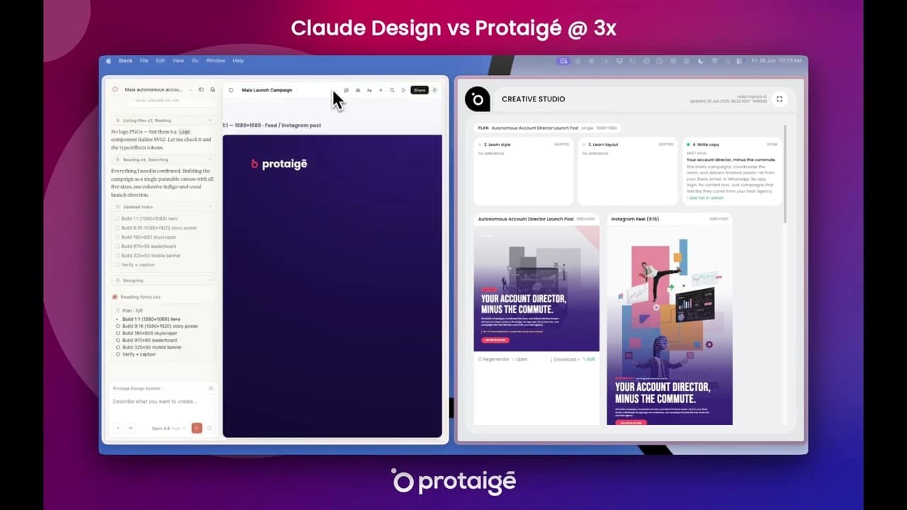
Claude Design was the strongest of the six, and the only one that kept the brand. It used the right deep indigo and coral (#FA638D), put the purple-to-pink gradient on the wordmark, and opened our fonts.css to set headlines in Bebas and body text in Poppins. It even found our actual SVG logo and used it, where every other tool faked a mark or left it out. Each size was laid out properly rather than cropped, and the five formats look like one campaign.
Imagery is where it falls short. It generated no hero image at all, choosing a "coral-glyph persona (no portrait)" and offering to "spin that up" if asked. If your campaigns need photography or illustration, plan on sourcing it yourself. Every asset also follows the same indigo-and-glyph direction, which keeps the set consistent and makes it repetitive.
It's also slow, and it asks a lot of you. I had to type the pixel dimensions for every format, then answer a round of clarifying questions before it read files and built each asset one after another. It was the slowest tool in the test, slower even than AdCreative's setup wizard. Sketch Studio had its full set finished before Claude Design showed a first frame.
What you get at the end is an HTML/SVG file. That's better than a flat image, since it's vector and the carousel is interactive. But to change a single headline you have to prompt again and wait for the whole file to regenerate, which is why editability scored 3.
2. ChatGPT: 70/130 (54%)
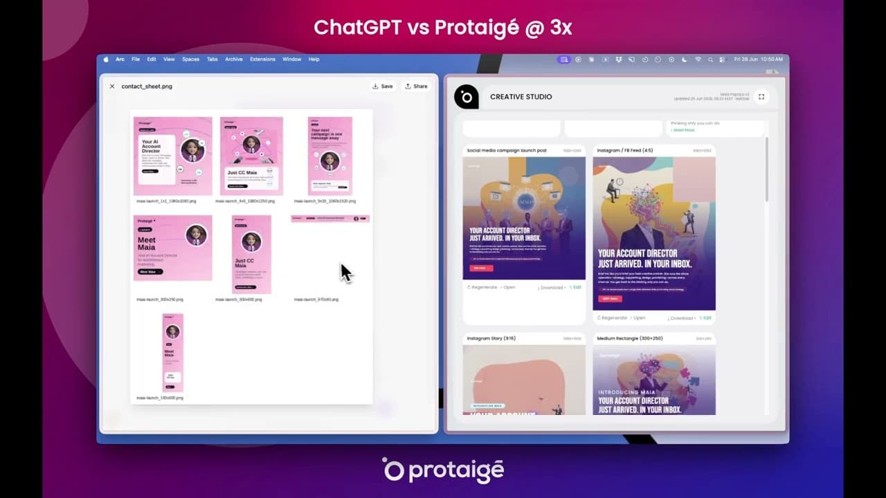
ChatGPT can't hold a brand kit, so it searched the web for one and ended up on the wrong sites (at one point, unimelb.edu.au). With nothing reliable to go on, it made flat hot-pink cards that appear nowhere in our palette, with the same stock headshot in the corner of all seven sizes. It told me itself that the logo was "typeset, not an official logo file".
It was very good at the words. The positioning around "autonomy not automation" was sharp, it built a sensible comparison table, and it was upfront about its own weak spots. It also made one clever technical choice: it set the text with Python rather than letting the image model draw it, so every word was legible. Legible, though not in our fonts.
You get a ZIP of flat PNGs and a landing page delivered as one image, so every change means describing it and regenerating the picture. It also spent 3 minutes 47 seconds thinking before producing the campaign. In the same session Sketch Studio made seven assets in the right sizes, under the headline "Your account director just arrived. In your inbox.", plus a live HTML landing page with numbered steps and a cyan band reading "she works where you already work".
A practical split, if you already pay for ChatGPT: use it to draft positioning and copy, then hand the words to a design tool.
3. Canva: 67/130 (52%)
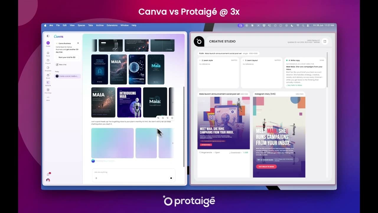
I told Canva to use protaige.com for context. It came back with the stock imagery of a generic AI launch: glowing brains, chrome androids and galaxy nebulae on dark teal and blue, in a default sans-serif. Nothing in the set uses our palette. Its own summary promised "Protaige branding integrated throughout", spelling the name without the accent.
Almost every asset was a variation on one centred-title card, and the landing page came out as a flat grid of features with green, teal and coral icons. The session was bumpy too. Canva showed "Stopped generating", then an "Error", then a notice that I'd reached my monthly AI limit, with an offer to upgrade.
Its editor is still the reason people choose Canva, and it scored 4 on editability. Everything lands in a mature editor you can work in by hand. If a designer on your team will finish every asset anyway, that matters. I compared that trade in more depth in Canva vs agency vs Sketch Studio. In this session, Sketch Studio made a square post, a story, three display banners and a full landing page led by "One brief. One agent. Fifty assets."
4. Gamma: 66/130 (51%)
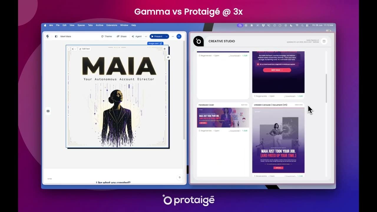
Gamma gave the only 1 in the whole test, for the logo. With our brand kit loaded, it drew a purple "P" over "PROTAIGE" in capitals, then added an "M" monogram we've never used. Around them it put gold type, a cosmic-blue landscape with a robot woman, a cartoon man and slides in black on cream.
Gamma makes presentations, webpages, documents, social cards and graphics, and it treats everything as one of those. Asked for a social campaign, it produced a deck about the launch rather than ads you could run. Every slide follows the same layout rules. Sketch Studio's set in this run was a square post, a 9:16 reel, a Facebook cover, a 4:5 LinkedIn carousel and two skyscraper banners, each arranged differently.
The copy was good, a 4, and the speed matched Sketch Studio's. If you need a pitch deck or a one-page site, Gamma is built for that job. For a multi-channel campaign it isn't.
5. Google Pomelli: 65/130 (50%)
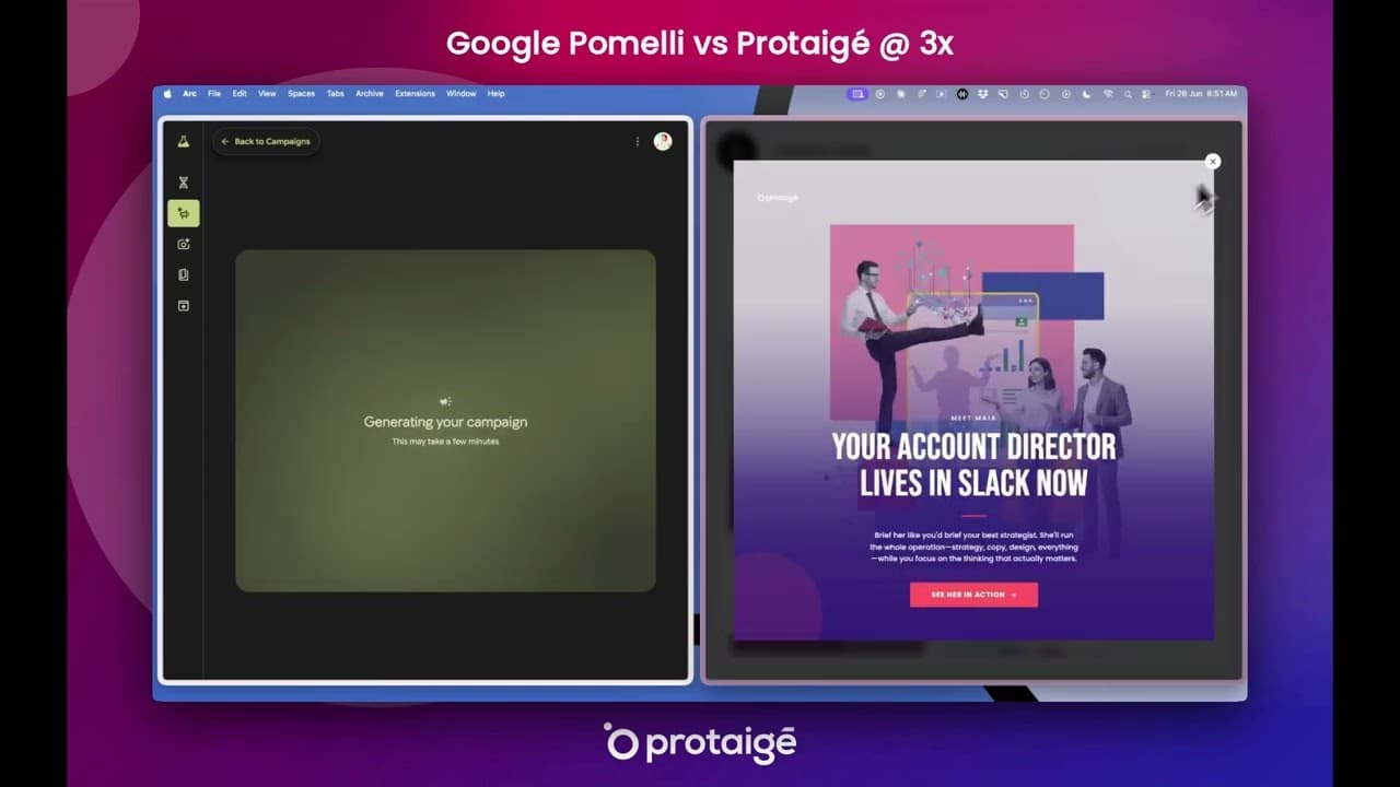
Pomelli, from Google Labs, builds a "Business DNA" profile from your website. It worked out that our brand is purple, which kept it from going badly wrong. The purple was flat and too bright, though, with no gradient, the type was a generic bold sans-serif, and the logo didn't appear on any tile.
Each run gave me four square posts built around the same hub-and-spoke clip art, with stock faces dropped in and the wording changed. The copy was fine ("Launch in 30 minutes, not days"). The hard limit is the format menu, which offers Story, Square and Feed. When I asked for a landing page, Pomelli had no way to make one.
Its editor surprised me. You get real layers for the header, description and call to action, a Fix Layout button and version history. For a small business that only needs square social posts, it covers the basics.
6. AdCreative: 61/130 (47%)
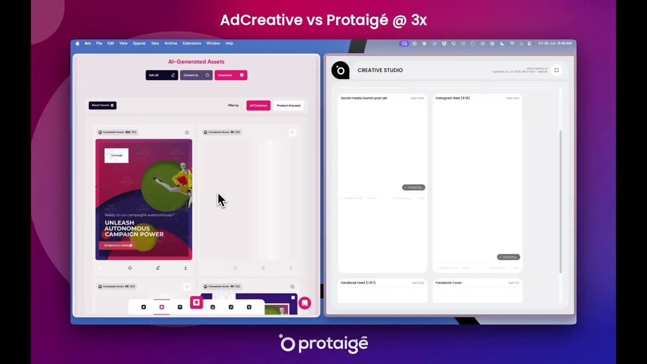
AdCreative had the brief and the brand kit, and finished last. Getting started meant a wizard that asks for size, a website scan, product, tone, audience, call to action and uploads. Then it produced one layout (a stock figure on a green circle) as about 150 variations, shuffling the copy and colours between them.
The colours were green and yellow on magenta, nothing like our brand, and the copy was generic ("Unleash autonomous campaign power"). One tile failed with "Oops, something went wrong" while I was recording. AdCreative only makes social ads, so landing pages, carousels, print and out-of-home formats aren't available.
It sizes social formats well, and apart from the failed tile the set completed. If you run high-volume tests of social ad variants and can live with its layouts, it will keep you supplied.
The full scorecard
Every criterion for every tool. The Sketch Studio column is the average of its six runs.
| Criterion | Weight | Sketch Studio | Claude Design | ChatGPT | Canva | Gamma | Pomelli | AdCreative |
|---|---|---|---|---|---|---|---|---|
| Speed | ×1 | 4.33 | 2 | 2 | 3 | 4 | 3 | 3 |
| Input effort | ×2 | 4.83 | 3 | 3 | 4 | 4 | 4 | 2 |
| Colour fidelity | ×2 | 5.00 | 5 | 2 | 2 | 2 | 3 | 2 |
| Typography fidelity | ×2 | 5.00 | 4 | 3 | 2 | 2 | 2 | 2 |
| Logo correctness | ×2 | 4.67 | 5 | 2 | 2 | 1 | 2 | 3 |
| Copy (on-message) | ×2 | 5.00 | 4 | 4 | 3 | 4 | 3 | 3 |
| Hero image generation | ×2 | 4.50 | 2 | 3 | 2 | 2 | 2 | 2 |
| Archetype fit | ×2 | 5.00 | 4 | 2 | 2 | 3 | 2 | 2 |
| Layout and composition | ×1 | 4.50 | 4 | 3 | 3 | 3 | 2 | 3 |
| Visual variety | ×2 | 5.00 | 3 | 2 | 2 | 3 | 2 | 2 |
| Fit for channel | ×1 | 5.00 | 5 | 4 | 3 | 2 | 3 | 4 |
| Channel breadth | ×2 | 5.00 | 4 | 3 | 3 | 1 | 2 | 1 |
| Multi-format coherence | ×2 | 5.00 | 5 | 3 | 2 | 2 | 2 | 2 |
| Editability | ×2 | 5.00 | 3 | 2 | 4 | 3 | 3 | 3 |
| Reliability | ×1 | 4.67 | 4 | 3 | 2 | 3 | 3 | 3 |
| Total /130 | 126.5 | 99 | 70 | 67 | 66 | 65 | 61 |
Sketch Studio's six runs scored 130, 127, 122, 126, 128 and 126. It wasn't perfect: speed scored 4 in four sessions, the smallest banners were sparse in a few, one reel thumbnail came out hazy, and the logo placement scored 4 twice.
What AI design tools do well, and where they struggle
Averaging the six tools on each criterion shows a clear split.
| Criterion | Average of the six | Sketch Studio |
|---|---|---|
| Copy (on-message) | 3.50 | 5.00 |
| Fit for channel | 3.50 | 5.00 |
| Input effort | 3.33 | 4.83 |
| Layout and composition | 3.00 | 4.50 |
| Editability | 3.00 | 5.00 |
| Reliability | 3.00 | 4.67 |
| Speed | 2.83 | 4.33 |
| Colour fidelity | 2.67 | 5.00 |
| Multi-format coherence | 2.67 | 5.00 |
| Logo correctness | 2.50 | 4.67 |
| Typography fidelity | 2.50 | 5.00 |
| Archetype fit | 2.50 | 5.00 |
| Visual variety | 2.33 | 5.00 |
| Channel breadth | 2.33 | 5.00 |
| Hero image generation | 2.17 | 4.50 |
Brand kits don't guarantee on-brand output
Every tool had some way to know what our brand looks like, and five still drifted away from it. Canva went to robots and nebulae, Gamma to an invented logo, Pomelli to an approximate purple, ChatGPT to flat pink and AdCreative to green and yellow.
The reason shows up in how these tools build an asset. Most start from a fixed layout and pour the brand into it, so your kit ends up as a colour swap on a design someone else made. AdCreative makes this plainest, with the same stock figure on the same green circle 150 times. Sketch Studio works the other way round: it reads the colours, type, logo and visual style stored in your Brand DNA first, then builds each format on its own layout. A brand kit only protects your brand if the tool designs from it rather than decorating a template with it.
When you trial a tool, look past the colours. Check whether it used your real logo, your fonts at each level of the hierarchy, and imagery that could plausibly be yours.
Check the format list before anything else
Variety and channel breadth had the lowest averages, and in several cases that's a hard limit rather than a weak result. AdCreative makes social ads. Pomelli makes three social formats. Gamma makes decks and pages. No amount of prompting will get a landing page, a display banner and a carousel out of those tools from one brief. If your campaigns run on more than a couple of channels, rule tools in or out on this before you compare quality.
Don't pick a tool for its copy
Copy and channel sizing had the highest averages. Most tools now write competent headlines and get the dimensions right, and ChatGPT and Gamma both scored 4 on copy. Good headlines in a demo tell you little about how a tool will hold your brand across a whole campaign.
Claude Design is worth a look if your brand is mostly type and colour
It was the only other tool that got the brand right. Where it struggled (imagery, variety, speed and editing a single element) matters less if your visual identity is mainly typography and geometric shapes, and if you're comfortable describing every change in a prompt.
Which AI design tool should you use?
Each tool suits a different job:
- Canva if someone on your team will finish every asset by hand. The editor is the strongest part; the AI output needed the most fixing.
- Gamma for a pitch deck or a one-page website, with good copy built in.
- ChatGPT for drafting campaign copy and positioning before the design work starts.
- Google Pomelli for a small business that wants square social posts from its website.
- AdCreative for high-volume testing of social ad variants, if its layouts work for you.
- Claude Design for a coherent, brand-accurate set where imagery isn't needed and time isn't tight.
- Sketch Studio when one brief has to become a full campaign across social, display and web, with original imagery and assets you can edit element by element.
What this test can't tell you
One live run per tool is a snapshot. Any of these tools might do better with a different brief or on a different day, and they all ship updates often. Everything here reflects the versions I tested in June 2026.
I wrote the rubric, chose the weights and did the scoring, which is why every recording is public. Two scores also lean on what I know about Sketch Studio beyond what's on screen. I confirmed its element-by-element editing in the product, because not all of it is visible in the videos. And its channel menu lists billboard, mobile leaderboard and out-of-home sizes that not every session rendered.
The fairest next step would be a panel of independent scorers using the same rubric on the same recordings. If you'd like to be on it, get in touch.
Try your own brief
Every recording above is a first attempt with nothing cut. The quickest way to check my scores is to give Sketch Studio one of your own briefs and put the result next to whatever tool you use now.
Frequently asked questions

Chrissy has spent two decades inside the marketing process Protaigé is transforming. She directed global campaigns for Mercedes-Benz, Coca-Cola, and Johnson & Johnson, then founded two companies that scaled to multi-million dollar outcomes: Quickcut, which transformed Singapore's print advertising delivery, and PaperplaneCo, a B2B creative agency serving Adobe and SAP for 15 years. She's seen firsthand how marketing intelligence gets trapped in agency relationships, scattered documents, and people's heads - and watched it walk out the door every time someone left.
CONTINUE READING
Brand Voice Gap: Why Your AI Content Sounds Like Everyone Else's
AI writes generic content because you haven't given it your brand. Fix the input, and the output fixes itself.
 Wawa Gilewski
Canva, Agency, or Sketch Studio? How to Choose Where Your Marketing Creative Gets Made
Templates you can ship this afternoon, or agency work that comes back after the second rebrief. That isn't the whole menu.
Wawa Gilewski
Stuck in Marketing No Man's Land: The Mid-Market Agency Gap
There's a chasm between DIY tools and $500k retainers, with a lot of very tired marketers in it.
Wawa Gilewski